An Interior Design Case Study - A Kitchen & Living Area Renovation in Ascot Vale
A recent project that involved internal, interior based works, was in a family home in Ascot Vale. The project is a great example of how smaller aesthetic changes can make monumental differences to the experience of a home. The client first approached us with the main concern being the aesthetics of the living, dining and kitchen areas of their house that they’d lived in for over 20 years. This encompassed the entire rear area which was very dated and very dark.
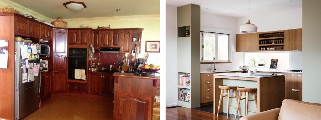
Before: the dated, dark kitchen. After: the new kitchen in adjusted location
The focus of the project was influenced by a few different factors. Firstly, the existing front section of the house encompasses more traditional rooms including bedrooms and a more formal sitting room which didn’t really need work. They were also going through a life transition as their kids had moved out and the house no longer accommodated their lifestyle. The clients are big entertainers and the way the house was, didn’t allow that to happen in an easy fashion. One of the clients is an artist and wanted to have a dedicated studio space.
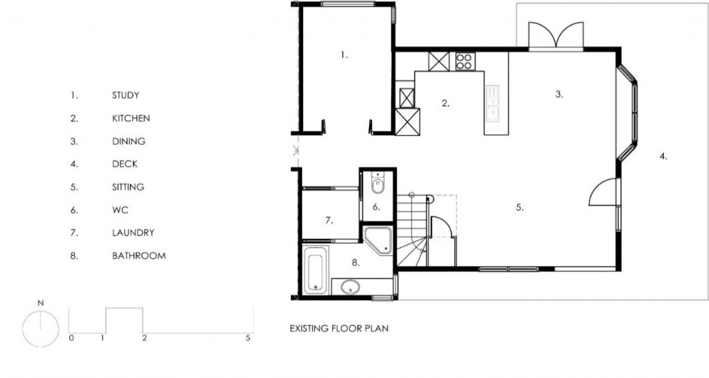

The living spaces in the home were already generally open plan but, in order to improve the relationship between each area, a bit of shifting of the living, dining and kitchen zones was necessary. The kitchen was on the north side without any windows. The initial design decisions were in response to a typical passive solar design approach where we wanted to open up the north side with windows. This would also improve the view, which looks across the Maribyrnong River valley. By moving the kitchen to where the sitting room was, the whole space could then open up and address the outside to the north and east. The design process also involved looking at how we could use the space more effectively. For example, using the space under the stairs more efficiently by placing an open pantry underneath it.

Above: A pantry under the stairs is one example of reworking poorly used spaces to increase usable floor area.
The pallet of selections was kept quite simple and the place now feels light, fresh and calming. Darker toned floor coverings including timber floor boards and rubber in the kitchen, created a crisp contrast between the floors and the rest of the selections that are much lighter. The addition of new lighting assisted with creating a new feel in the spaces that was much more customisable depending on the occasion.
The renovation was completed entirely within the existing building fabric besides a small extension to allow for a window box seat. This made the living room a lot more functional as the space wasn’t quite wide enough to allow for an adequate sitting area. The seat is sunny and highly used with plenty of storage underneath. A unit that allows the television to be hidden was also important due to the proximity to the dining room.

Above: the new living area with a window box seat and a television hidden within a joinery unit.
Improving the connection to the outside by adding double doors onto the deck also helped enhance the overall feel and usability of the space. The servery in the kitchen also brings in the outside and encourages the connection between the indoor and outdoor zones.

Above: Connection to outside was improved by adding double doors and a servery window in the kitchen.
In regards to the budget, the clients did eventually spend a bit more than they anticipated. There was an ongoing process of ensuring that costs went towards things that gave a real ‘wow-factor.’ The intention was to not stray from the underlying intention of improving areas that would create an increased return when they eventually sell. In a project like this, you don’t often end up overcapitalising. You’re refreshing finishes in an understated way, not adding more area. You’re re-working what’s there which allows the space to function well – enhanced by the interior colours, finishes and details.
Click here to read more about this project in an article by the team at Houzz. There’s also a few more before shots in the comments below.